Your camera’s histogram is one of its most useful tools — and one of the most misunderstood. The LCD preview can fool you with screen brightness, sunlight, and viewing angle, but the histogram shows you exactly how the tones in your photo are distributed, from pure black to pure white. In this guide you’ll learn what a histogram is, how to read it at a glance, and how to use it to avoid clipped highlights and crushed shadows.
What Is a Histogram?
A histogram is a bar graph that maps every pixel in your image according to its brightness. The horizontal axis runs from 0 on the far left — pure black — to 255 on the far right — pure white. Between those extremes sit 256 tonal levels, with shadows on the left, midtones in the middle, and highlights on the right. The vertical axis shows how many pixels fall at each brightness level, so a tall peak simply means a large number of pixels share that same tone.
Two things are worth knowing before you rely on it. First, there is no “correct” histogram shape in the abstract — it only describes what is in front of your lens. Second, your camera computes the histogram from a processed JPEG preview (even when you shoot RAW), which means it reflects your picture style, contrast, and white-balance settings rather than the full data your sensor actually captured.
Reading the Graph: Shadows, Midtones, and Highlights
Divide the graph mentally into thirds. The left third represents the shadows and dark tones, the middle third the midtones, and the right third the highlights and bright tones. A typical well-lit scene produces a curve that starts on the left, rises through the midtones, and tapers off toward the right — but plenty of great photographs break that pattern, and that is fine.
What matters is where the data is concentrated and whether it is being cut off at the edges. A dark, moody scene will naturally pile pixels up on the left, while a bright snow scene pushes them toward the right. Read the shape as information, not as a score.
How to Spot Clipping
Clipping is the one warning sign you should always look for. It happens when pixels hit the absolute limits of the scale — 0 (pure black) or 255 (pure white) — and detail is lost because there is no value beyond the edge.
A tall spike pressed hard against the left edge means crushed shadows: dark areas have gone to solid black with no recoverable texture. A spike against the right edge means blown highlights: bright areas such as a bright sky have gone to solid white. In a JPEG this detail is gone for good. RAW files hold more highlight headroom, so if you shoot RAW you can often recover some of it — which is why many photographers pair the histogram with the “highlight warning” (blinkies) to double-check.
There Is No “Perfect” Shape
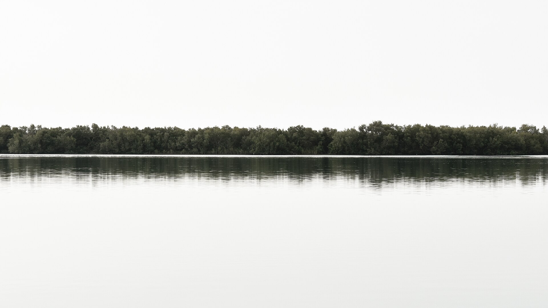
Do not chase a centered, bell-shaped curve. A silhouette photographed at sunset should hug the left edge, and a high-key portrait against a white background should sit far to the right — both are intentional and correct. The histogram does not judge your photo; it reports where your pixels land. Your job is to decide whether that matches the image you intended to make.
Luminance vs. RGB Histograms
Most cameras show a luminance histogram by default, which combines the brightness information of the red, green, and blue channels into one graph. That is convenient but can hide a problem: a vivid blue sky can blow out the blue channel while the combined luminance histogram still looks fine. If your camera offers an RGB histogram, switch to it when color accuracy matters — it shows each channel separately so you can spot channel-specific clipping that the luminance view would miss.
Using the Histogram in the Field
Turn the histogram on in your camera’s display or playback menu so you can check it while shooting, and glance at it after every important frame. If the highlight side is spiking against the right edge, reduce the exposure with negative exposure compensation. If the shadows are piling up against the left, open up the exposure or add light.
A popular technique is to “expose to the right” (ETTR): push the data as far to the right as you can without clipping, then darken the image in post. Because brighter areas of a sensor record less noise, this can preserve cleaner shadow detail — but only if you keep the highlights just short of the edge.
Conclusion
The histogram is the most honest exposure tool on your camera. It is unaffected by screen brightness, harsh sunlight, or a poorly calibrated monitor, and it tells you in a single glance whether you are losing detail in the shadows or the highlights. Learn to read it quickly, check it often, and you will come home with fewer clipped frames and far more confidence in your exposure.
FAQ
What does a histogram tell you?
It shows the distribution of tones in your image, from pure black (0) to pure white (255), so you can see at a glance whether your photo is underexposed, overexposed, or losing detail at either end.
Should a histogram always be centered?
No. A centered, bell-shaped curve is only “ideal” for an average, evenly lit scene. Dark scenes naturally skew left and bright scenes skew right — what matters is whether detail is being clipped at the edges.
Why does my histogram look different from the final photo?
Your camera builds the histogram from a processed JPEG preview, not the raw sensor data. Picture style, contrast, and white-balance settings all shape it, and RAW files usually contain more highlight headroom than the histogram suggests.
Related Posts
Rule of Thirds and Leading Lines: Master the Two Most Important Composition Rules
Composition is what separates a snapshot from a photograph. A…
Understanding ISO in Photography: A Complete Beginner’s Guide
Exposure is the foundation of every photograph, and three settings…
Metering Modes Explained: How Your Camera Measures Light
Before your camera can set a correct exposure, it has…