Color is one of the most powerful tools a photographer has, yet it is often the least understood. You can nail focus, exposure, and composition, but if the colors in your frame clash or feel muddy, the image still falls flat. Color theory — the study of how colors relate to one another — gives you a framework for choosing and combining colors deliberately, so your photos feel balanced, emotional, and intentional. In this guide, we’ll break down the color wheel, the main color harmonies, and how to put them to work both in camera and in editing.
The Color Wheel and the Three Building Blocks
Every color you see can be described by three properties: hue, saturation, and lightness. Hue is the “pure” color — red, blue, yellow, and everything between. Saturation is how intense or washed-out that color is; a fully saturated red is vivid, while a desaturated red drifts toward gray. Lightness (sometimes called value or brightness) is how light or dark the color appears.
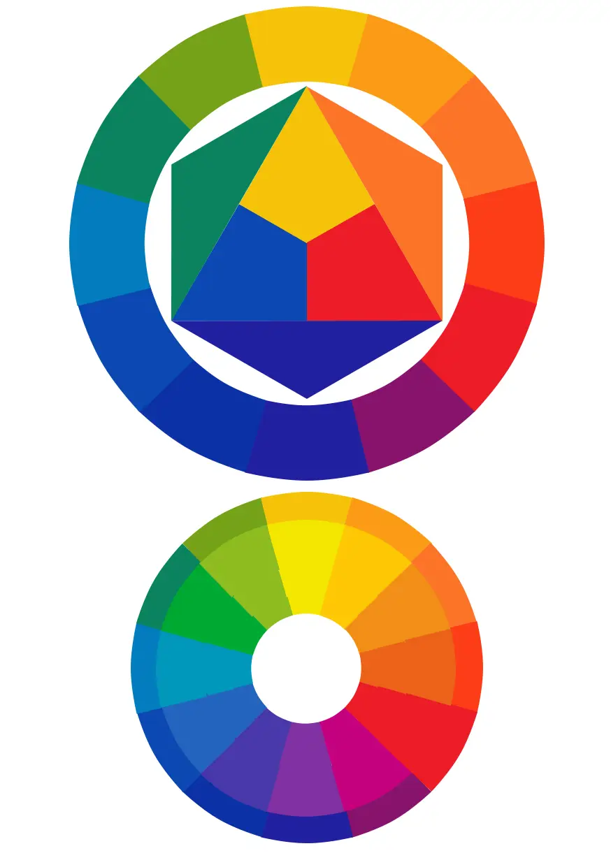
The color wheel arranges hues in a circle and is the classic reference for understanding how colors interact. Opposite colors on the wheel are complementary; neighbors are analogous. These simple spatial relationships are the foundation of every color scheme photographers use, whether they realize it or not.
The Main Color Harmonies
Complementary colors sit opposite each other on the wheel — blue and orange, red and green, yellow and purple. Placing them together creates maximum contrast and makes both colors pop. This is why so many striking photographs feature a warm subject against a cool background: a golden sunset against a deep blue sky, or an orange flower against green foliage. Because complementary pairs are high-energy, use one as the dominant color and the other as an accent.

Analogous colors sit next to each other — for example, yellow, yellow-green, and green. They create a calm, cohesive look because they share a common hue. Analogous palettes appear everywhere in nature (think autumn foliage) and give images a serene, unified feel with little risk of clashing.
Triadic colors are three hues evenly spaced around the wheel, such as red, yellow, and blue. They offer vibrant variety while staying balanced. Triadic schemes are harder to pull off because three strong colors compete for attention, so they usually work best when one color dominates and the other two support it.
Monochromatic is less a wheel relationship than a discipline: a single hue explored across different levels of saturation and lightness. Monochrome doesn’t only mean black-and-white — a photo built entirely from shades of blue is monochromatic too. The result is a clean, minimal, and very deliberate look.
Warm vs Cool Colors and Emotional Weight
A second, more intuitive axis is warm versus cool. Warm colors — reds, oranges, and yellows — advance toward the viewer and feel energetic, cozy, or even aggressive. Cool colors — blues, greens, and purples — recede and feel calm, distant, or melancholic. You can use this to guide the eye: a warm subject on a cool background instantly becomes the focal point, while a cool subject against warm surroundings can feel isolated or serene.
Color temperature also sets mood. A photo dominated by cool blues reads quiet and clinical; the same scene shifted toward amber feels nostalgic and inviting. This is exactly what your camera’s white balance setting controls, which is why getting white balance right — or deliberately “wrong” for creative effect — is one of the fastest ways to shape an image’s emotional tone.
Applying Color Theory in Camera and in Editing
You can apply color theory before you press the shutter and long after. In the field, it is about noticing relationships: look for complementary pairs (a red jacket against a green hedge), seek out analogous scenes (a field of gold and orange grasses), and watch how the light’s color temperature shifts through the day. Golden hour naturally produces the warm/cool contrast that makes so many photos sing.
In editing, color theory becomes a precision tool. Most editors expose hue, saturation, and luminance (HSL) controls that let you shift individual colors: you can nudge a blue sky toward teal to complement a warm subject, or desaturate a distracting background color so it stops competing. Presets and profiles are just packaged color theory. Fujifilm’s film simulations — Velvia’s punchy saturation, Classic Chrome’s muted tones — are carefully engineered color harmonies, while Canon’s Picture Styles and Sony’s Creative Looks do the same job with adjustable intensity. Understanding the theory underneath lets you choose and tweak these profiles instead of applying them blindly.
Practical Tips for Stronger Color
- Start with one dominant color and let everything else support it.
- Use complementary contrast to make a subject stand out, but keep the accent small.
- Set white balance deliberately — don’t leave it on auto and hope.
- In editing, use the HSL panel to reduce, not just boost: desaturating everything except your subject’s color is a powerful move.
- Shoot during golden hour or blue hour, when nature hands you a warm/cool palette for free.
Conclusion
Color theory is not a set of rigid rules; it is a vocabulary for thinking about why some color combinations feel right and others do not. Once you can name what you are seeing — complementary contrast, an analogous palette, a warm subject against a cool background — you can start making those choices on purpose instead of by accident. The color wheel is one of the few tools in photography that costs nothing, weighs nothing, and will improve every photo you take.
Frequently Asked Questions
What is the color wheel in photography?
A circular arrangement of hues used to understand color relationships — such as complementary and analogous pairs — helping you combine colors deliberately in a frame.
What are complementary colors and why do they matter?
Colors opposite each other on the wheel (blue/orange, red/green, yellow/purple). They create high contrast and make a subject stand out from its background.
How does white balance relate to color theory?
White balance controls the warm/cool cast of an image, which is the warm-versus-cool axis of color theory in action.
Do I need to memorize the color wheel?
No. Learn the two or three relationships you use most — complementary, analogous, and warm versus cool — and you will cover the vast majority of real-world scenes.
Related Posts
Food Photography: A Complete Guide to Mouth-Watering Shots
Great food photography makes people hungry. Whether you are shooting…

Time-Lapse Photography: The Complete Guide to Shooting Stunning Time-Lapses
Time-lapse photography compresses minutes, hours, or even days into a…

Blue Hour Photography: A Complete Guide to Shooting the Deep-Blue Twilight
There is a short window twice a day when the…