Your camera can capture millions of colors, but which of those colors actually make it into your final file depends on one setting many photographers ignore: the color space. Choose the wrong one and a vibrant sunset can look flat online, or a print can come back muddy and desaturated. Here we break down sRGB, Adobe RGB, ProPhoto RGB, and Display P3 — how they differ, how big each gamut really is, and which one you should reach for when you shoot, edit, and export.
What Is a Color Space?
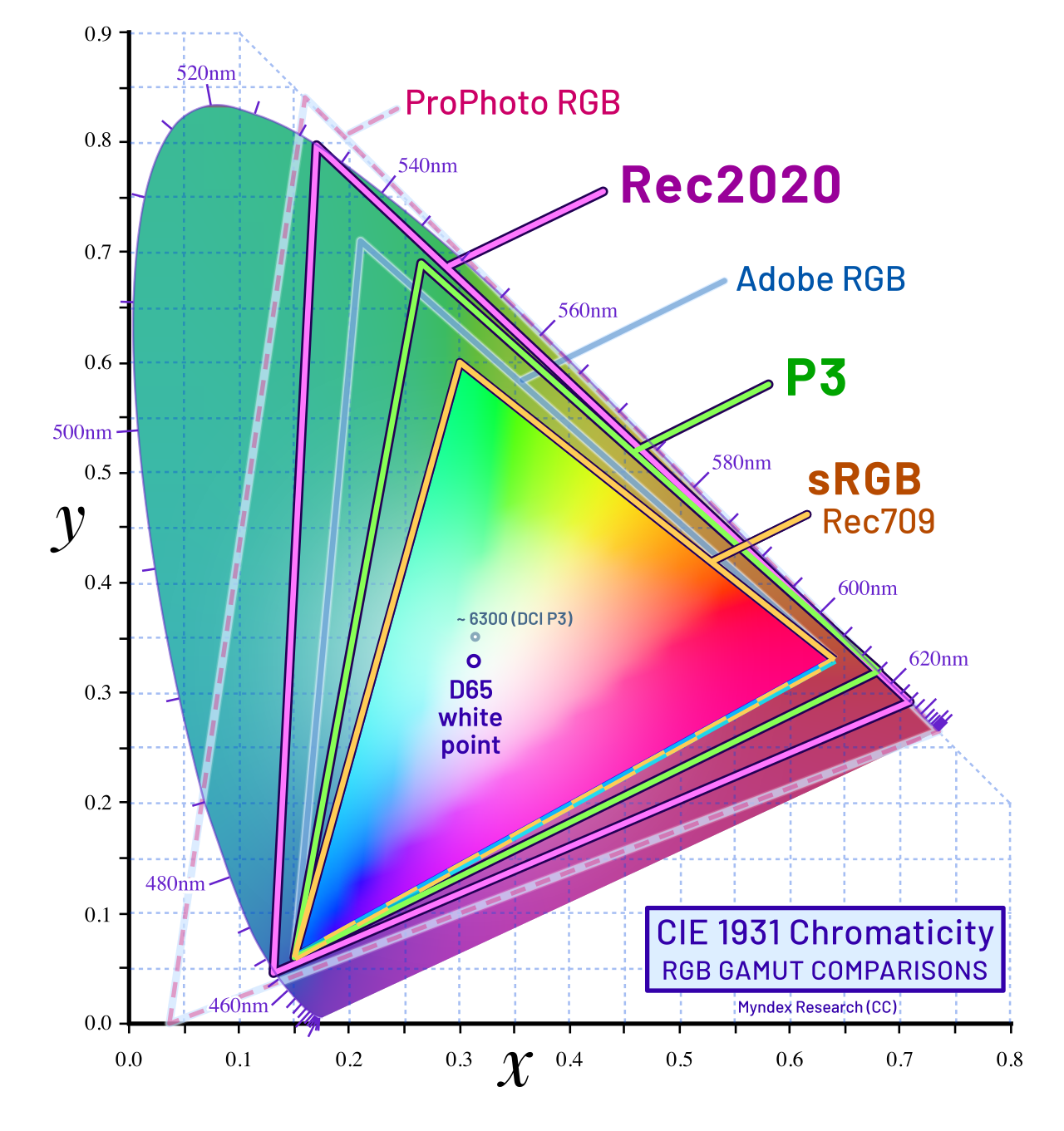
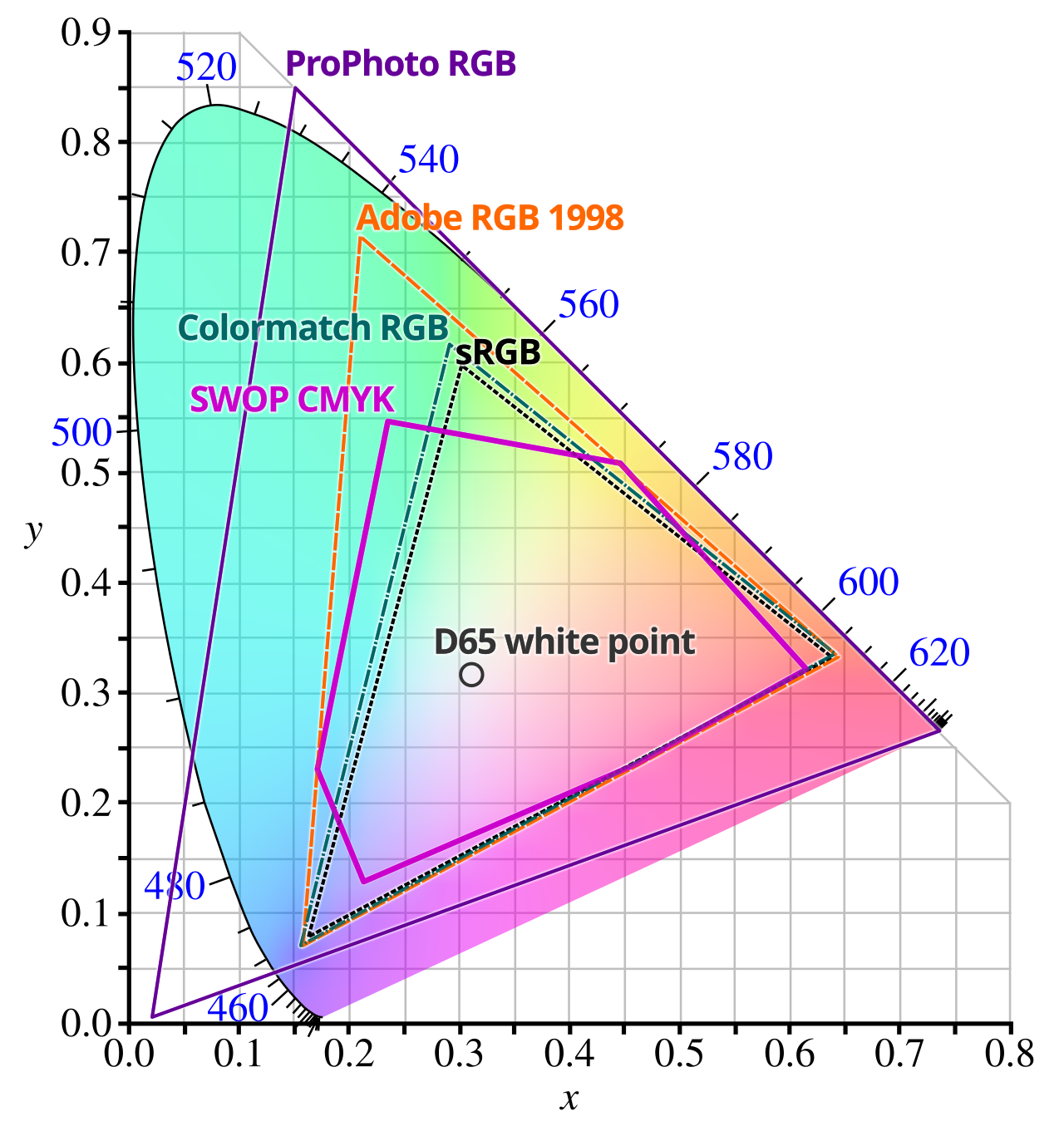
A color space is a defined range of colors — its gamut — plus a precise way of encoding those colors as numbers. The human eye can perceive far more color than any screen or printer can reproduce, so color spaces carve out a standardized slice of it. The usual way to visualize this is the CIE 1931 chromaticity diagram, the familiar “horseshoe” that maps every color a typical human can see. Each working color space is a triangle drawn inside that horseshoe: the three corners are the space’s red, green, and blue primaries, and the area inside is every color the space can represent.
sRGB — The Default Standard
sRGB was created in 1996 by HP and Microsoft, and it covers roughly 35% of visible colors. That sounds small, but it’s the universal default: the web, virtually every consumer monitor, and most phone screens are built around it. Because it’s so widespread, sRGB is the safe “lowest common denominator” — an sRGB file will look essentially the same on any standard display. The trade-off is that it’s the smallest common working space, clipping the saturated greens and cyans that printers can often still reproduce.
Adobe RGB — Built for Print
Adobe introduced Adobe RGB in 1998 specifically to close the gap with printing. It stretches the green and cyan primaries outward to cover a little over 50% of visible colors. That extra range matters most on paper: the greens and cyans Adobe RGB adds map closely to what a CMYK press or inkjet can output. If you print your own work, processing or converting into Adobe RGB can carry more of that color through to the page. Two caveats: you need a wide-gamut monitor to actually see the difference, and an Adobe RGB file posted to the web without conversion will look flat and undersaturated.
ProPhoto RGB — The Editing Powerhouse
ProPhoto RGB is the giant of the group, covering around 90% or more of visible colors. Its gamut is so large that two of its three primaries are imaginary colors that fall outside the visible spectrum entirely. That’s by design: ProPhoto RGB is not a space you deliver in, it’s a space you edit in. Working in ProPhoto RGB (in 16-bit) preserves the maximum color data from your raw file so that heavy edits and conversions never clip anything. Virtually every raw processor uses a ProPhoto-like space as its internal working space behind the scenes.
DCI-P3 and Display P3 — Cinema and Mobile
DCI-P3 began life as the digital cinema standard, covering about 45% of visible colors but biased toward more saturated reds and greens than sRGB. Apple adapted it as Display P3, which ships on iPhones, iPads, and Macs, and most modern OLED phone screens can now display P3. It sits between sRGB and Adobe RGB in total size, making it a popular middle ground for video and for images viewed on modern mobile screens.
Why Bit Depth Matters
Gamut size and bit depth are linked. sRGB in 8-bit — 256 levels per channel — is usually smooth enough. But stretch a wide gamut like ProPhoto RGB across only 8 bits and the levels sit so far apart that smooth gradients, like a clear sky, start to show banding. That’s why ProPhoto RGB should always be edited in 16-bit, and why converting a finished 8-bit sRGB image up to ProPhoto won’t reveal any new color — the extra levels were never captured in the first place.
Which Color Space Should You Use?
- Web, social media, sharing — export sRGB. It’s what every site and screen expects.
- Printing your own work — use Adobe RGB if your monitor and printer both support it; otherwise sRGB is the safer bet.
- Editing and archiving — work in ProPhoto RGB at 16-bit as your master, then convert a copy to sRGB or Adobe RGB on export.
- In-camera setting — sRGB or Adobe RGB; note this only affects JPEGs and previews, never the raw file itself.
Conclusion
Color space isn’t the most glamorous setting in your camera, but it’s the difference between a photo that looks right everywhere and one that looks flat or banded. The rule of thumb is simple: edit wide, deliver narrow — ProPhoto RGB in 16-bit while you work, sRGB for the web, and Adobe RGB for print. Set your export preset once and you’ll never have to think about it again.
FAQ
Does shooting in a wider color space give my raw file more color?
No. A raw file captures the sensor’s data regardless of the in-camera color-space setting, which only affects JPEGs and previews. You choose the actual working space when you process the raw.
Why do my photos look different after I upload them to the web?
The site or browser usually assumes sRGB. If your image is tagged Adobe RGB or ProPhoto RGB and hasn’t been converted, colors shift or wash out. Export a web copy as sRGB to avoid surprises.
Should I buy a wide-gamut monitor?
Only if you print or do color-critical editing. For web-only work, a well-calibrated sRGB display is simpler and avoids the “why does it look different on my phone?” problem.
Image credits: gamut comparison diagrams from Wikimedia Commons (CC BY-SA 3.0 / 4.0), credited in their captions.
Related Posts

Depth of Field: A Complete Guide for Photographers
Shallow depth of field isolates the subject against a blurred…
Camera Filters Explained: ND, Polarizer, and UV — What They Do and When to Use Them
Walk into any camera store and you will find a…
HDR Photography Explained: Capturing the Full Range of Light
Point your camera at a sunset, a church interior, or…